 CALL US
About 5 years after smartphones came on the scene (yes, kiddos, there was a time before smartphones!) we began to hear the term “mobile-first marketing.” This was due to the simple fact that web usage on smartphones and tablets quickly began to dominate over time spent on desktop and laptop devices.
Even 4 or 5 years ago, it wouldn’t be surprising to see about a 50/50 mix of mobile and desktop usage on a site. No more. Mobile has won the battle for eyeballs in a big way, and the question now is how much longer desktop viewership will even be worth talking about.
Some Stats
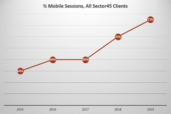
Google Analytics tracks the types of devices used to access your site. They call this “% mobile sessions” and “% desktop sessions.” Across our clients, % mobile sessions currently ranges from 59% to 85%, with an average of 73%. That means that just about 3 out of 4 people viewing our clients’ sites are checking them out on a smartphone or tablet.
Here are the historical averages over the past 5 years:
What You Need to Consider
Here are some things to think about when planning for a mobile-centric web presence.
Mobile-Focused Design
While you will still come across many different site layouts when browsing on your mobile device, some pretty common mobile design standards exist now. For instance, the “hamburger” menu in the upper right of the screen to access navigation or search features for a site. Your site doesn’t have to follow every common design element for mobile devices, but keep in mind that anything unexpected is just inviting confusion and risks a user leaving your site quickly.
We recommend very simple layouts, larger text, and simplified navigation for mobile sites. Your mobile audience is not looking to read a chapter about a certain plastic surgery procedure. They want to see your address/phone, view before and afters, get reviews, take a quick look at your bio, and maybe send a quick contact message. Prioritize those elements to make their visit effortless.
Mobile-Focused Updates
It’s easy to fall into this trap: you’re used to seeing your site on a desktop when working in the office, so when you come up with a new page, a special to promote, or want to add a new staff member bio, you think of how it will look on a desktop screen. But as you’ve seen, most of your site visitors are coming from devices, not desktops.
Here’s an example of how this might trip you up: You put together a nice big graphic with details of your latest monthly specials and send it over to your web team to put on your site. It looks super compelling on your desktop. But now pull up that page on mobile. Are the specials even legible on the vastly scaled down image? Probably not. A responsive layout with an image free of text and content below it will work much better on the full range of devices and computers.
Mobile Accessibility
If you haven’t been following the debate about whether the Americans with Disabilities Act (ADA) applies to websites, here’s a crash course. The argument is that, like parking spaces and ramps, reasonable accommodations also need to be made online so that people with disabilities have sufficient access to the information, systems and apps that have become an essential part of everyday life. While there is not a definitive ruling on this yet, making sure your site is fully accessible to anyone with a smartphone is the inclusive and, in our opinion, right thing to do.
Mobile Conversions
All these folks visiting your site on mobile won’t mean much if they’re not taking the next step and getting in touch with you. So how does conversion on smartphones and tablets compare to those on desktop? It’s better than you think!
If we look at form conversions across clients so far in 2019, we see that 71% of form completions occur on mobile. That’s pretty much in line with the 73% of visits coming in from mobile. We don’t have enough reliable data about calls from devices, but think about your own behavior – when was the last time you actually dialed a business’s phone number? The vast majority of calls are coming from Google listings or from people visiting your site on a phone.
Mobile Campaigns
Given that so many people are spending so much time on their phones and tablets, you have to meet them where they are and target your marketing to mobile devices. Text message marketing has been a fantastic tool for several of our clients. And email marketing has gone mobile as well, which is why we recommend shorter eblasts so that you can get your message across to someone who wants to quickly scroll through your latest message on their phone.
Mobile Apps & Social Media
Your site is not the only thing that has become increasingly mobile. Social platforms like Facebook and Instagram are dominated by mobile users. If you or a staff member is posting during work hours on a desktop, always remember that the mobile experience on these platforms is the one that really counts. Keep your images visually simple and your text straight to the point.